
When choosing a career in design there is so much data to shuffle through in order to find the selection you want to work towards. Sites like Glassdoor and Ziprecruiter have useful data, but their processes are run by algorithms impenetrable to the average jobseeker. A job seeker trusts their matchmaking system.
An answer to this problem may be to look at the raw data presented by the government census to understand what jobs are in demand around graphic design fields. This approach comes with its own problems. Below I included a screenshot of the interface for the quarterly census of wages from the U.S. Bureau of Labor Statistics.
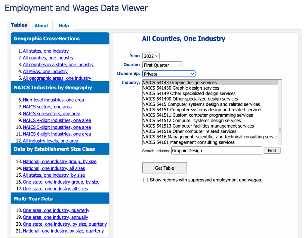
Not immediately intuitive, right? This tool has the potential to very precisely retrieve the data that you want about nearly any industry in any past time period from the census. That precision is wasted without accurate, concise presentation.
That’s where an infographic would come in.
Once we run our search through the interface, we get a chart that looks like this:

Or, that’s what the first section of it looks like. The first page continues down two more thirds of what I’ve shown and has seven pages in total. It contains reported wages and employment for graphic designers in every county in the United States. This is an incredibly powerful database tool. It only needs a good designer in order to interpret and present this data so see if the career measures up to others requiring similar skillsets.

Leave a comment