
This week we continued talking about color’s symbology and explored the process in which a designer develops ideas into rough concepts and then pitches them.
These concepts, From Craig Smallish’s linkedin Course and the Psychology of Color powerpoint by Arber Minxhozi, will help me break down the symbology in a magazine advertisement.
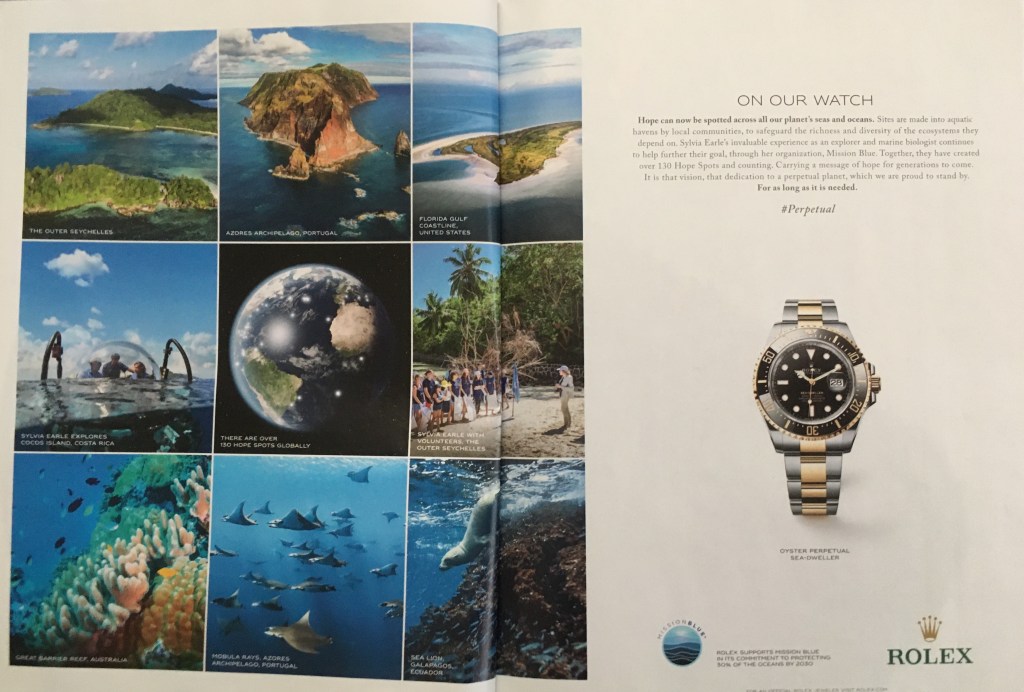
Volume 176, Issue 3 of Esquire has an advertisement for a Rolex wristwatch. The two-page spread primary focuses on two elements: the grid of photos on the left and the watch on the right. As the point of highest contrast, black against the white background, the Rolex watch stands out on the right side of the page and draws the eye. The second point of highest contrast is the globe of Earth against the black of space. The grid around the globe is dominated by blue. In their powerpoint, Minxhozi tells us that blue is connected to feelings of comfort and security. This is an appropriate choice by the designer. Rolex is communicating its support to Mission Blue’s environmental mission of creating safe havens around the world. The face of the watch, the globe, and Mission Blue’s logo are all circles, equating Rolex’s product with Mission Blue’s goal.

Leave a comment