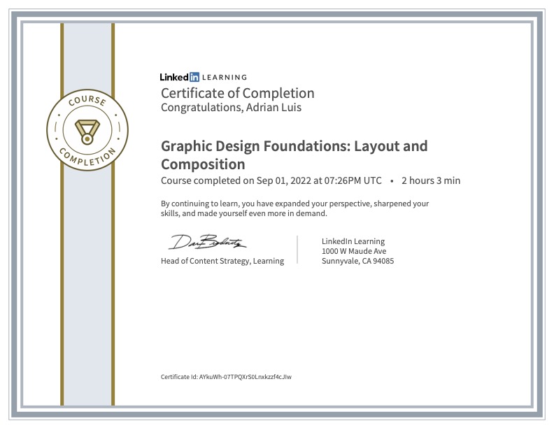
LinkedIn Learning Summary: Graphic Design Foundations
Sean Adams’s course on graphic design basics emphasizes simplicity and boldness. For as long as we can keep the viewer interested, Adams says, they will digest our message.
Adams prefers minimalistic designs with lots of negative space, simple shapes, and bright colors all loosely based on a grid template.
Adams describes visual design as a puzzle that the designer creates for the viewer. The puzzle must be engaging to hold attention, but concise in order to communicate its message.
By Adams’s standards, if the words and images are redundant in their meaning, they aren’t valuable to the design’s message. The words and images should create a new meaning in context with one another.
Because graphic design is intended for a global society, the designer must be aware of the target audience for their designs. In the course, Adams explains how color can have different associations for different individuals and different cultures. He gives an example of a few colors with variable meaning. White in western cultures is associated with purity while in eastern cultures associate it with death.
With these recommendations in mind, Adams acknowledges that they are loose guidelines broken when the designer needs to intuit a unique solution.


Leave a comment